Project
Develop for Good: Building a content design system for volunteer matching
UX Content Design
Project
UX Content Design
Overview
Develop for Good (DFG) is an organization that matches volunteers, looking to gain product experience, to nonprofit organizations' digital projects. The DFG website allows potential volunteers, mentors, and nonprofits to learn about the mission, application process, and impact created through the organization.
DFG serves many different user types ranging from volunteers to nonprofit clients. This makes it difficult to maintain a consistent, yet distinct voice across the website. These factors have resulted in content that lacks clarity and deters those hoping to accomplish tasks such as applying to be a volunteer or sharing a project. The project displays the importance of content in shaping a brand's voice and user experience. I led a UX content design team to create a content design system.
The DFG site serves prospective volunteers, mentors, nonprofit clients, and executive board members.
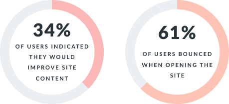
From an initial survey sent out to existing users, 34% of users indicated they would improve site content. In addition, site analytics showed that over 61% of users bounced when first opening the site. These insights expose the shortcomings of the existing site content in connecting with the user. We also felt there was a huge opportunity to improve the user's site experience. As a result, our team felt it was necessary to continue exploring the site content and the potential issues.
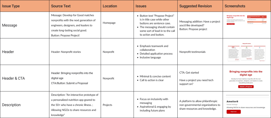
We conducted a content audit of the DFG site which included team members going through the site, from page to page, and collecting website assets. Our team documented details including the content, screenshots, location, comments, and proposed revisions.
Issues found:
.png)
The team identified DFG competitors and their content strategy relative to DFG. We explored competitors' sites and noted the voice, tones, and content style.
Strengths: Navigability, User journey, Guidance, Value propositions, Assets, Consistency
Weaknesses: Brand voice, Redundancy, Cognitive load, Narrative, Call to action, Formatting
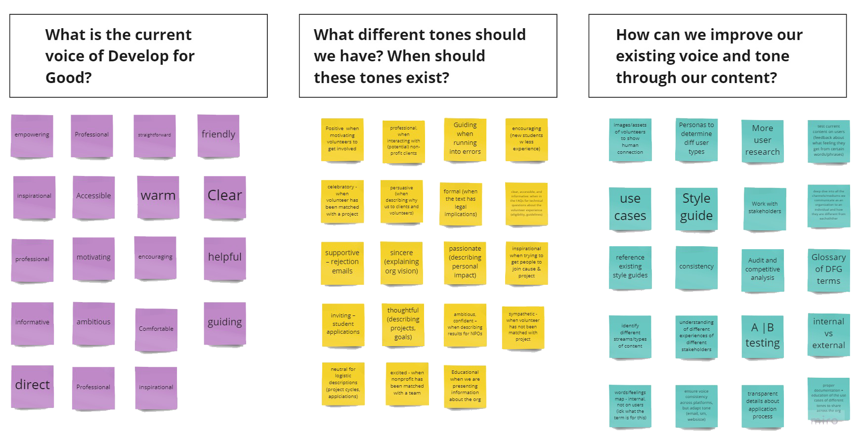
I led a mapping activity where we answered 3 questions: What is the current voice of DFG? What different tones should we have? How can we improve our existing voice and tone?
Key takeaways:
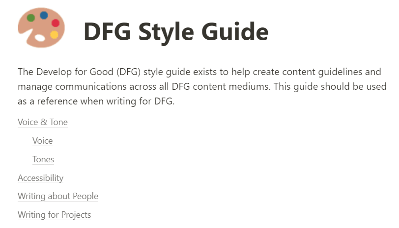
The DFG style guide ensures content contributors create clear and cohesive content that maintains brand consistency. It contains comprehensive guideline rules expressing content should look, sound, and feel. These guidelines are categorized as follows:
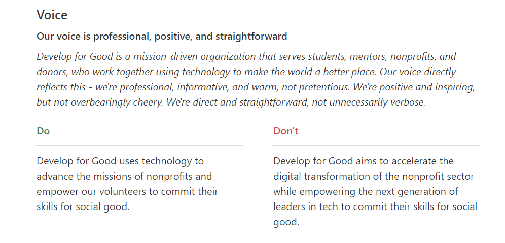
Voice is the personality of a brand or product. Our team defined DFG's voice as professional, positive, and straightforward to maintain across all mediums. This choice intends to get the audience involved in our mission of using technology to make the world a better place.
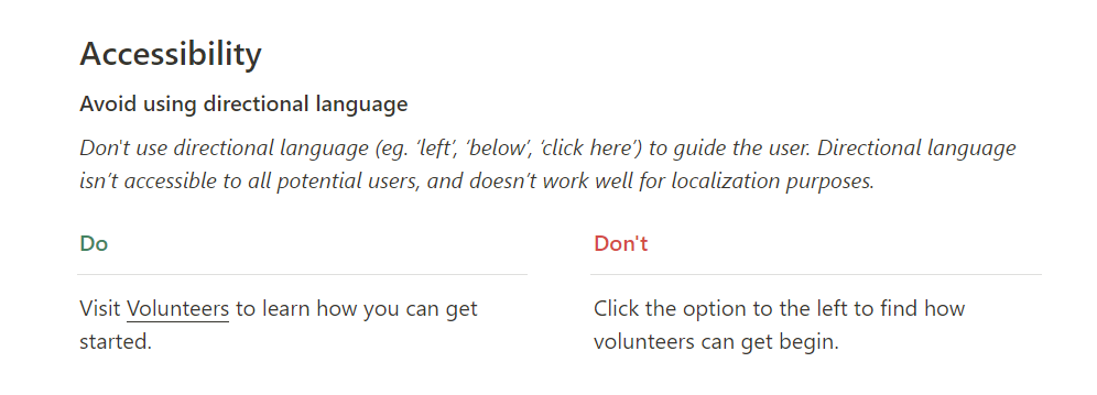
Accessibility in content directly affects how users experience our site. We created guidelines ensuring how content is written and formatted is inclusive for users of all types. In the example, we specified avoiding directional language as this requires visual cues from users to understand.
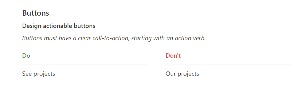
Buttons are visual and textual interface elements that allow users to take action in a tap. These buttons contain a call-to-action that prompts users to accomplish a task. Our team created guidelines and proposed suggestions to make the content consistent, reflective of the intended action, and concise.
Through conducting research and creating the style guide, our team determined site areas where content could be optimized. This section focuses on headers, buttons, and the application flow.
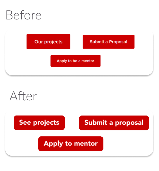
Issues
Improvements
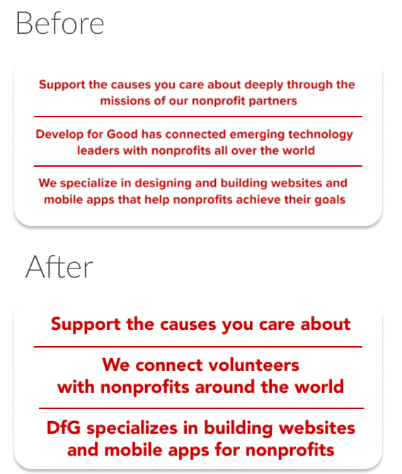
Issues
Improvements
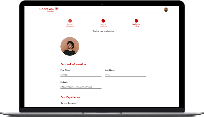
A primary goal at DFG is for prospective volunteers and mentors to get involved. To get started, users go through an application process to input their information, experience, interests, and reasons for applying. We collaborated with the UX design team to develop an application flow. The team wanted to ensure the UI content reflected our style guide in the following ways:
Following the implementation of proposed changes, there should be continued auditing of the existing site. There should also be more research into DFG users' expectations and needs.
The style guide has become a source that DFG board members refer to when creating content for the website and external communications. Additionally, with the launch of the UX content design initiative, UX content designers utilize the guidelines as a framework when developing content for nonprofit clients. Through the process, I discovered the importance of different perspectives and collaboration.