Project
TikTok: UX content design for mobile ad landing pages
UX Content Design
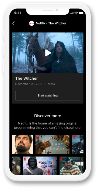
Project
UX Content Design
Overview
TikTok is an app for mobile videos where users can post and also find videos that are personalized for them. Brands and companies are also able to run video ads that promote users taking specific actions such as making a purchase. TikTok hopes to broaden its partnerships with companies that have a subscription or event-based business model.
Upon tapping a TikTok ad, users are directed to an advertiser's site where relevant information and intended actions aren't always present. This leads to increased dropoff and reduced conversion for brands.
The project attempts to bridge the gap between user expectations after tapping an ad and the interface content. I developed a user flow for both subscription and event ads based on the advertisers' conversion goals (i.e purchasing a video streaming plan) and the most intuitive flow for the user. The flow allowed me to strategize and create content based on these different needs.
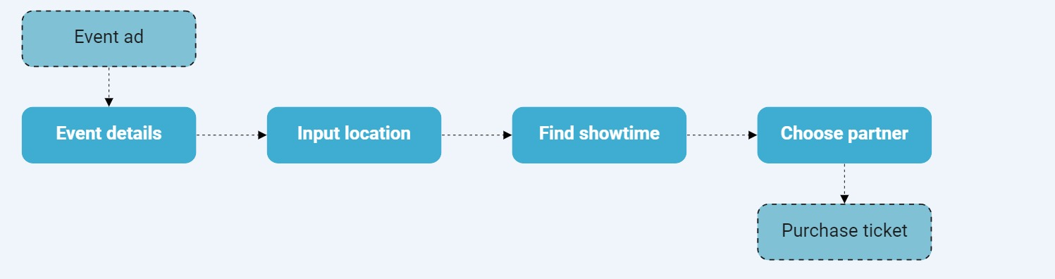
Event ads revolve around creating hype for events (i.e movies) and getting users to purchase tickets. After clicking an event ad on TikTok, the user is taken to a landing page. On this screen, users can locate event details, input a location, and find showtimes for their event. Additionally, users can choose an event partner where they will be directed to their site to purchase tickets.
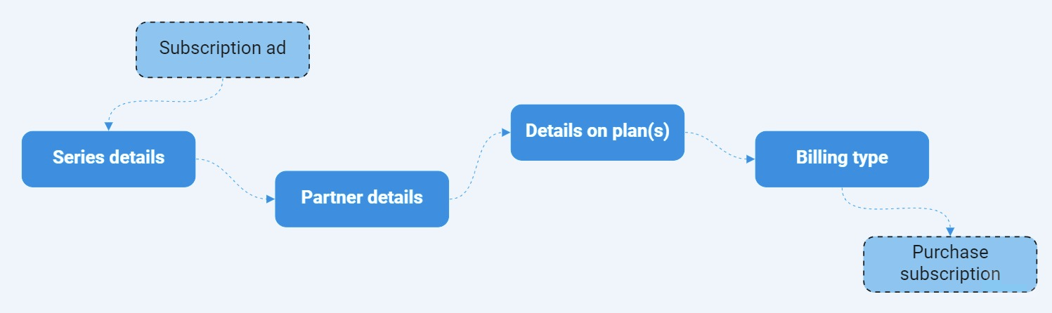
Subscription ads are centered on offering users a recurring service (i.e Netflix subscription). When a user clicks on a subscription ad, they are taken to a landing page. Within the page, users can find details about the series, subscription partner, and plans. If there are multiple plans, users can choose the plan and corresponding billing type. The user will be prompted to continue to the subscription partner's site to complete their purchase.
I worked with the UX designer to design the UI for event and subscription ads. This creation process involved analyzing different competitor content and similar interfaces. From then, I drafted many different versions for each section of content.
I mapped out the content in lo-fi wireframes to envision how it would look and feel on the interface. From there, I compared my content versions to one another based on factors including:
.png)
.png)
After presenting and incorporating suggestions from the rest of the team, I finalized the content. After development and rounds of testing, the team launched subscription and event ads to TikTok advertisers and users.
As the team gets more user insights through testing, I want to reexamine the prioritization of the interface content. This investigation helps me understand if certain content (i.e plan details) should be more easily accessible. In addition, I can determine if the path is consistent with what advertisers expect. As more advertisers use the ad types, I foresee a more modular design to customize content.
The newly designed subscription and event ads content benefits both users and advertisers. Advertisers can directly sell their services while users can find all pertinent information to make a purchase.
As a UX content designer, I learned the importance of creating a flow before developing content. The flow allowed me to understand the user's journey through the landing page and account for where I needed to provide content. Another lesson was on collaboration and how it shaped the final content. In the process, I worked directly with the team to solicit feedback on versions of content. This feedback helped me get important insight and perspective to create the final version. I hope to involve more future teams in the content development process.